Breaking Down My Branding Package
Last year, I noticed that many clients didn’t know or were confused about what certain deliverables were in a typical branding package (what’s the difference between a brand mark and logo?). With all the special jargon, I don’t really blame them!
In an effort to help people along their branding journey, I’ve put together guidelines on what exactly is included in a typical branding package. This post reiterates what I’ve put together, but if you’d like to download it, you can find it here.

01. Brand Strategy
Before we put pen to paper (or Apple Pencil to iPad), developing a solid strategy lays the groundwork for the visual identity and helps us ensure we’re on the same page before moving forward. We get to the heart of your business —who you are, who you serve, and how you stand out. All this info helps us create a brand that connects with your dream audience and sets you up as the expert you are!
After you fill out a detailed questionnaire, I comb through all the details and combine it with my own research to put together an in-depth strategy that covers:
Brand overview, story, and purpose
Brand vision
Brand keywords
SWAT analysis
Audience overview & keywords
Customer persona
Competitors overview & keywords
The difference, what makes you stand out
Brand messaging
Messaging keywords
Moodboard, style direction

02. Primary Logo
As the name suggests, this logo will be used the most often in the application of the brand. Compare it to the sofa in your living room. It’s the centerpiece, gets a lot of use, and should last a long time. Depending on the business, this logo should remain the most simple and anchor the rest of the identity. It’s usually used in the website navigation, so having it in a horizontal format works great. Sometimes, it is paired with the Mark to create a “Lockup” (as shown in the Miretta Interiors example below).

03. Secondary Logos
These logos are typically reconfigured versions of the primary logo, meant to fit different spaces and orientations. If the primary logo is horizontal, the secondary logo will be stacked and used for square or vertical layouts - such as for your social media avatar.
Other times, the secondary logos will be in different font styles, made into badges or other configurations, and include certain information like an address, established date, or tagline. This adds some variation to the visual identity and makes it feel more considered and elevated!
Depending on the scope of the project, we can craft multiple secondary logos that can be used in a variety of formats depending on your business’s needs.

04. Brand Mark
The Mark is a symbol that represents the brand that instantly helps identify a certain business. Think of Nike’s swoosh, or Target’s... Target! From an elegant monogram to a more complex illustration, the Mark can take on many forms. It can be used on its own, or sometimes it will pair with the Primary Logo.

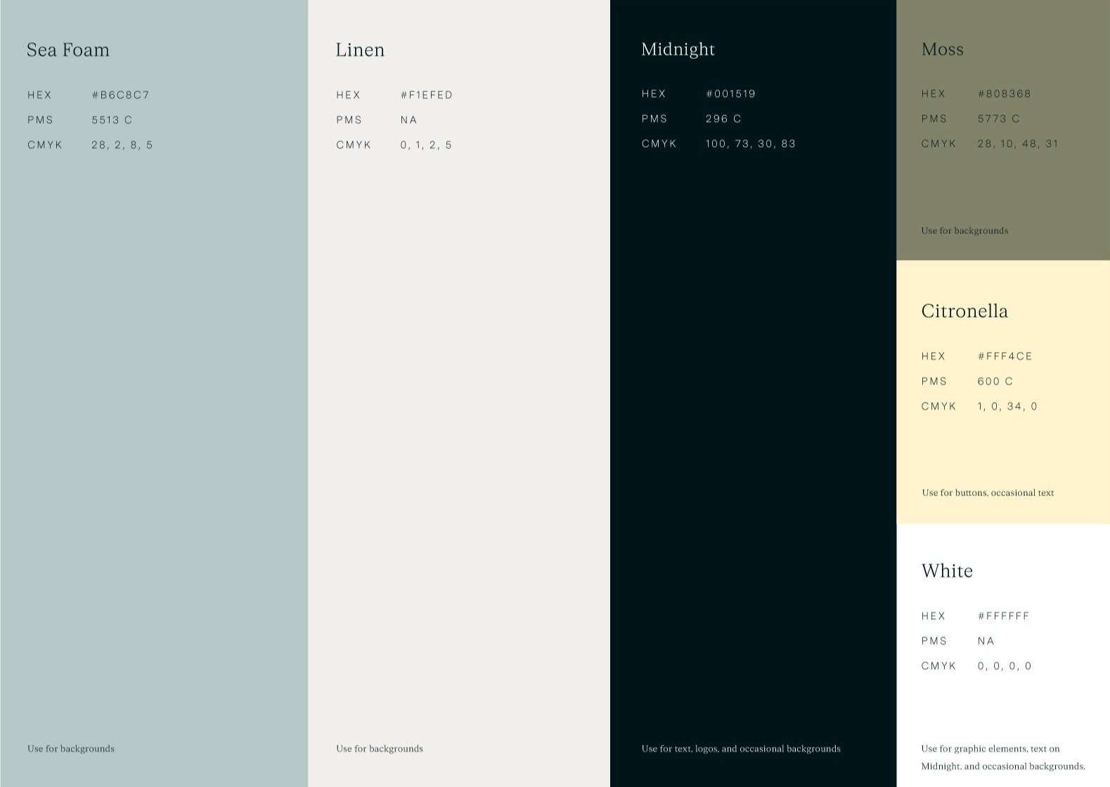
05. Color Palette
Every business needs a distinct color palette that’ll be used consistently across all platforms: website, social media, and printed materials. The palette can range from a simple three-color to a more complex palette of 10-15 colors. HEX, CMYK, and Pantone color codes are provided in the brand guidelines.
06. Typography
We’ll choose a selection of fonts that will be used on all branded material. In the brand guidelines, we’ll illustrate type styling - or how to format your type, from tracking (the space between letters) and leading (the space between lines in a paragraph). As fonts are not included in the project’s cost, we provide the links to purchase the licenses.

07. Graphic Elements
We’re expanding upon the core brand elements and creating graphics that will support them. These designs will be used as backgrounds that’ll enhance your brand on the website, social media, and printed material. From using the Mark in a pattern to using textures, there are a variety of ways to create more visual interest in the brand identity.

08. Custom Icons or Illustrations
Icons have a variety of uses but are particularly useful for websites. People rely on visual cues to guide them when they’re skimming a site, and icons enhance the experience and provide valuable visual information for the user.
Icons and illustrations can also be used for creating stickers, buttons, or other types of swag. I’ll guide you on how to use these little assets in your brand guidelines. Not every package will include these, as this really depends on the type of business you have and your needs.

09. Collateral
A brand truly shines in the details, and that’s where collateral comes in! I usually offer one print or digital item with my branding packages.
Print items include business cards, notecards, stationery, letterheads, sales sheets, and tote bags. I’m here to coordinate with the printer and order whatever you need for an additional cost. Digital pieces include email signatures, social media templates, or an online PDF. Of course, there are many other examples, and if you need help selecting what would be best for you, I’d be more than happy to chat through options.

10. Brand Guidelines
Toward the end of your project, you’ll receive guidelines on how to use your brand in the real world. Depending on the scope and budget, the guidelines can be an in-depth 40-page document that covers layout design, best practices and usage, social media design, etc — or it can be a simple 1 pager that lists out your brand assets, color, and typography. No matter what, the brand guidelines will list out your brand assets.
